Logo Investigation Homework
Warner Bros -
The very first Warner Bros. logo, used from 1923 to 1925, was a simple, arched serif type wordmark, later evolving into a shield with initials WB, which became the basis for the logo for the next 90 years.
Later in 1925 the company introduced a shield into the picture and
slowly started to evolve.
The logo was then once again refined in 1929 so that the initials WB
the entire shields so that the logo initials were much more clear and
readable. This meant that the logo would stick in peoples heads
easier.
As the technology got better so did the logos technical features. In
1934 the company was able to add the zooming effect into the logo
making it more pleasant to watch and see. Which then led to the
banner that was added in 1937.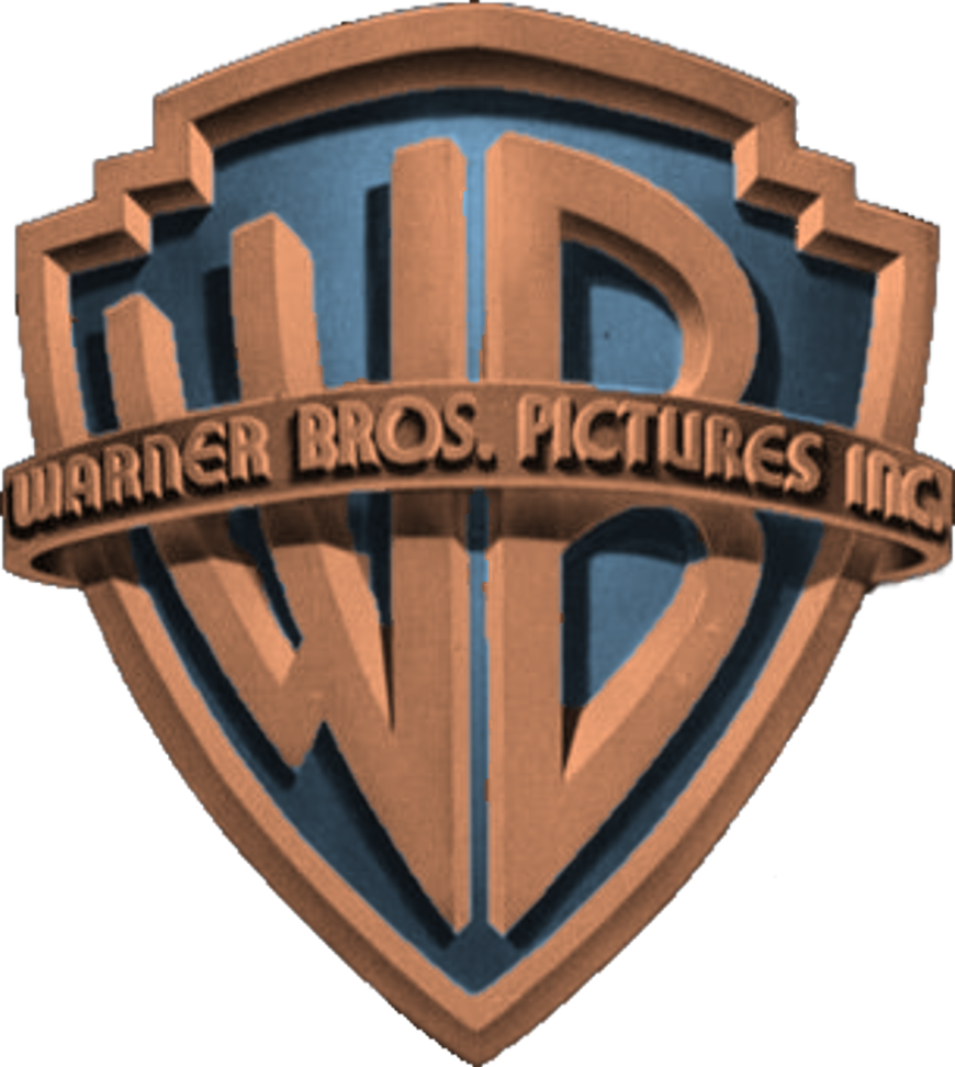
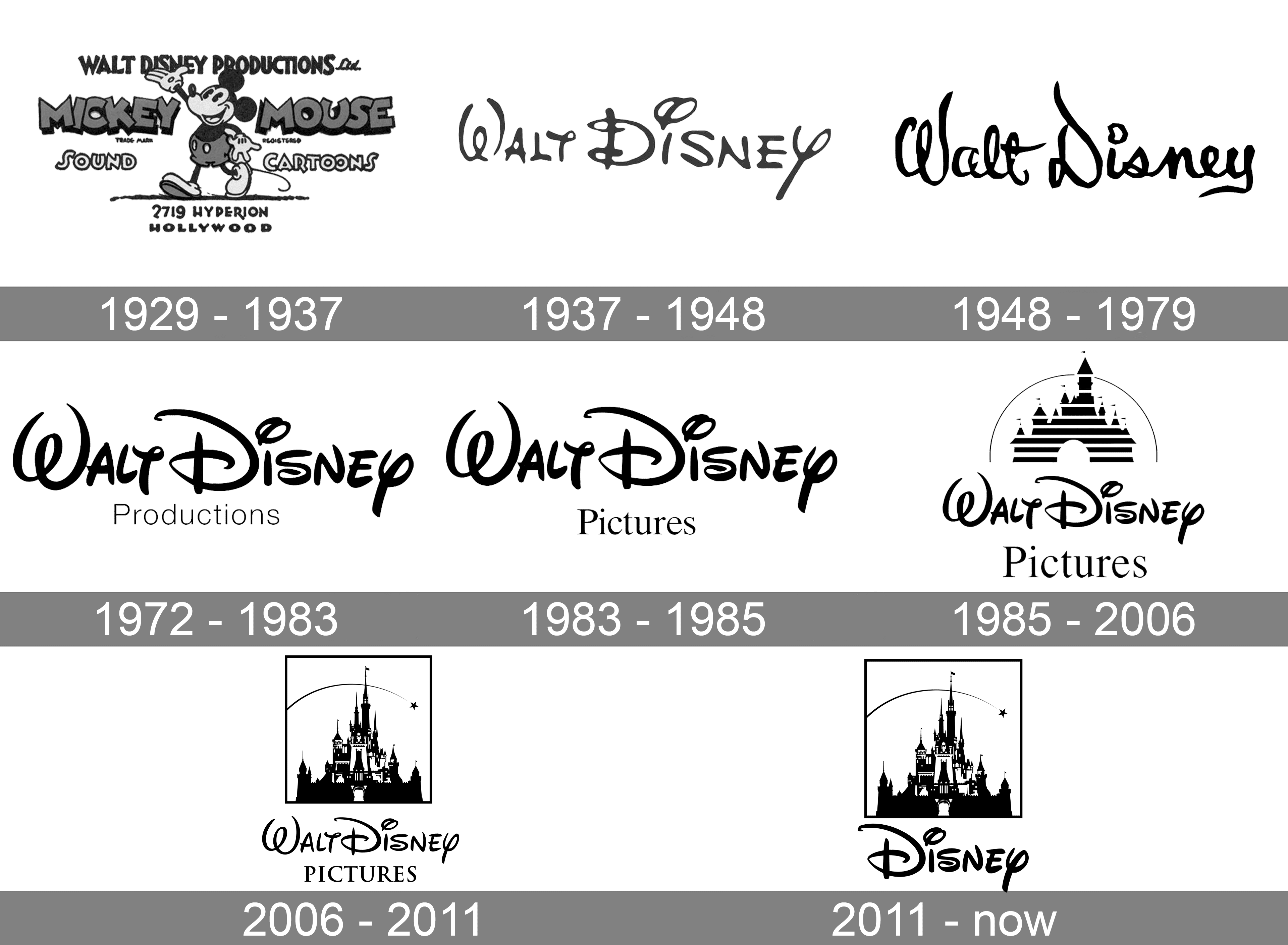
Walt Disney was founded in 1929 and the logo was created around their
This logo was then left as is for quite a few years and is the logo
that nowadays people know warner bros for. The logo has become very
iconic and whether people know it or not they will know the logo as
lots of famous movies have used it before.
Walt Disney -
Walt Disney was founded in 1929 and the logo was created around their
most famous character at the time Mickey Mouse. This logo was great
because it meant that people could easily relate Mickey Mouse to
the company Walt Disney. That logo would also help people to remember
the company as they start to make a name for themselves.
In 1937 the company then decided to switch up to use only words and
this was a big change to the entire logo and what was going to come of
it in the future.
The castle was then introduced into the logo in 1985 which would be
the start of what the logo is today. As time goes on the castle
becomes more and more detailed making it more and more interesting
to watch.
Pixar - 
The first Pixar logo was custom designed by John Lasseter, working with a stone cutter to design the font, and used on the face of what eventually became known as the Pixar Image Computer.
Initially, the logo was more straightforward, showcasing the Pixar
name with the lamp. However, as the company grew, it became more
animated, with the lamp hopping onto the "I" in "Pixar," becoming
a memorable opening animation for many Pixar films.
Luxo Jr. symbolizes Pixar's creativity, innovation, and character
driven storytelling. It represented the studio’s commitment to
pushing the boundaries of animation technology and storytelling,
becoming synonymous with Pixar's identity.
Illumination - 
Initially, Illumination's logo was a simple graphic of a glowing
light bulb, symbolizing creativity and innovation. This minimalistic
design reflected the studio's goal to bring new ideas to the animation
industry.
The logo's design evolved to highlight the word "Illumination" in a
bold, modern font. The light bulb was kept as the central motif,
reflecting the studio’s commitment to creating vibrant, visually
appealing films with clever storytelling.
The Illumination logo has remained relatively consistent, featuring
the glowing light bulb with subtle changes in animation style to match
the evolving technology and aesthetic. The logo appears in the opening
of most Illumination films, setting the tone for the whimsical and
family-friendly films
Paramount Pictures -
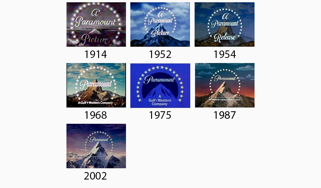
Over the years, the logo has undergone some minor updates to reflect the evolving animation industry. The stars surrounding the mountain have been rendered with a cleaner, more polished look to appeal to modern audiences while still holding onto the nostalgic design associated with Paramount's legacy.
Our Logo -
Initial Idea, Typed font effect, smoke, black background and decided name.

I changed the font but overall I was happy with the design of the logo.

Then I decided to change the smoke to not be so powerful but kept the new font.

Got rid of the smoke and added an eye but it wasn't my favourite option.

Shortened the duration down to 3.8 seconds

I decided to make it a jungle but then realised it is not suited for the thriller genre

I decided to go back to the original and SCALE stands for Sound,Camera,Action,Lighting,Editing


Comments
Post a Comment